
DSCI 554 lecture 9
Statistics review, statistical graphics
Dr. Luciano Nocera

Outline
- Basics of statistics and modeling
- Statistical graphics
- Tools
Statistics
Types of statistics
- Descriptive statistics: summarize the data, i.e. one number stands for
a group of numbers
Examples: mean, median, SD
- Inferential statistics: infer (model) population data from sample data
Examples: hypothesis testing, regression analysis
Nomenclature
| Observed | ML | Stats |
|---|---|---|
| Observations | Samples | Cases |
| Attribute | Feature | Independent variable |
| Class | Label | Dependent variable |
What are the independent and dependent variables?
Height depends on age
Time spent studying affects test score
Medication in persons with Parkinson's Disease affects the SD of the step length
Measures of order
Kth order statistic: value at position k in ordered data
Range: range of values
Modes/peaks: most frequent values
$$
\text{data} = [X_{1},\dots,X_{N}] = [0, 1, 1, 2, 2, 3, 4, 15] \\
1^{st} \text{order: } X_{1} = \min(X_{1},\dots,X_{N}) = 0 \\
N^{st} \text{order: } X_{N} = \max(X_{1},\dots,X_{N}) = 15 \\
\text{range: } X_{N} - X_{1} = 15 \\
\text{modes: } \{1, 2\}
$$
Quantiles
- Quantiles are robust to outliers.
- q-quantiles ($q-1$ values) divide the observations in $q$ groups.
Ex: 4-quintiles or quartiles ($Q_1, Q_2, Q_3$) divide the data in 4- $Q_1$ s.t. $25\%$ at or below and $75\%$ above
- $Q_2$ s.t. $50\%$ at or below and $50\%$ above (median)
- $Q_3$ s.t. $75\%$ at or below and $25\%$ above
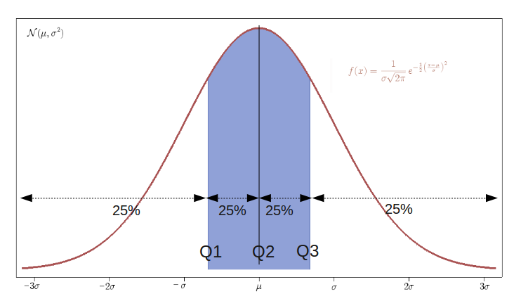
$$\text{data} = [0, 1, 1, 2, 2, 3, 4, 15] \\
Q_1 = 1, Q_2 = 2, Q_3 = 3.25$$
Based on SciPy formulation. In the example $N=8$ with N+1 parts. k-th q-quantile: $p = k/q$, $h = (N +
1)p$, $x{\lfloor}h{\rfloor}
+ (h − {\lfloor}h{\rfloor}) (x{\lfloor}h{\rfloor} + 1 − x{\lfloor}h{\rfloor})$
Measures of central tendency
Median: value in the middle
Mean: sum divided by N
$$ \mu = \bar{X} = \sum_{i = 1}^{N}{\frac{X_i}{N}} $$
Standard deviation: dispersion
$$\sigma = \sqrt{ \frac{1}{N - 1} \sum_{i}^{N}{({X_i - \bar{X}})^{2}}}$$
Variance: variation around the mean
$$\sigma^2$$
$$ \text{data} = [0, 1, 1, 2, 2, 3, 4, 15] \\
\text{median: } \tilde{X} = 2 \\
\text{mean: } \bar{X} = 3.5 \\
\text{standard deviation: } \sigma = 4.810702 \\
\text{variance: } \sigma^2 = 23.142857
$$
Skewness
left-skewed
left-tailed
skewed to the left
symmetric unimodal (not implied)
right-skewed
right-tailed
skewed to the right
Frequency & Relative frequency
Frequency: times event $i$ occurs
$$n_i$$
Relative frequency: frequency normalized
$$f_i = \frac{n_i}{N}$$
with
$$N = \sum_{k=1}^{K} n_{k}$$
$$
\text{data} = [A, B, B, A, C, A, C, A] \\
\text{ } \\
n_A = 4, n_B = 2, n_c = 2 \\
\text{ } \\
f_A = \frac{4}{8} = 0.5, f_B = \frac{2}{8} = 0.25, f_C = \frac{2}{8} = 0.25 \\
\text{ } \\
N = n_A + n_B + n_c = 4 + 2 + 2 = 8
$$
Data types
| Statistic | Nominal | Ordinal | Interval | Ratio |
|---|---|---|---|---|
| Frequency | Yes | Yes | Yes | Yes |
| Median and percentile | No | Yes | Yes | Yes |
| Mean, SD, SEM* | No | No | Yes | Yes |
| Ratio, rate of variation | No | No | No | Yes |
Outline
- Basics of statistics and modeling
- Statistical graphics
- Tools
Importance of graphing before analysis [Anscombe73]
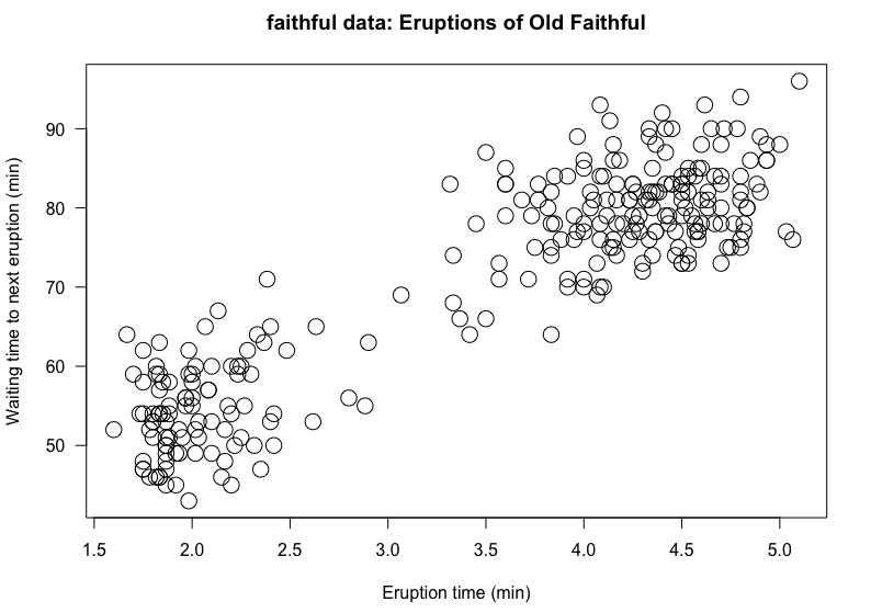
Scatterplot
Shows distribution modes, skewness, outliers
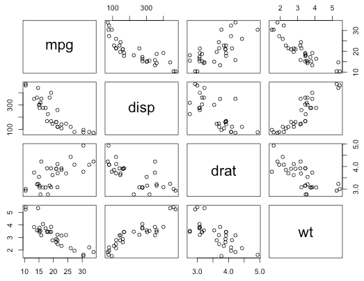
Scatterplot matrix
Shows distribution for multivariate data
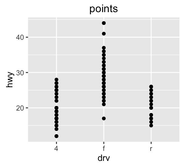
Stripchart (1D scatterplot)
Good for comparison across categories
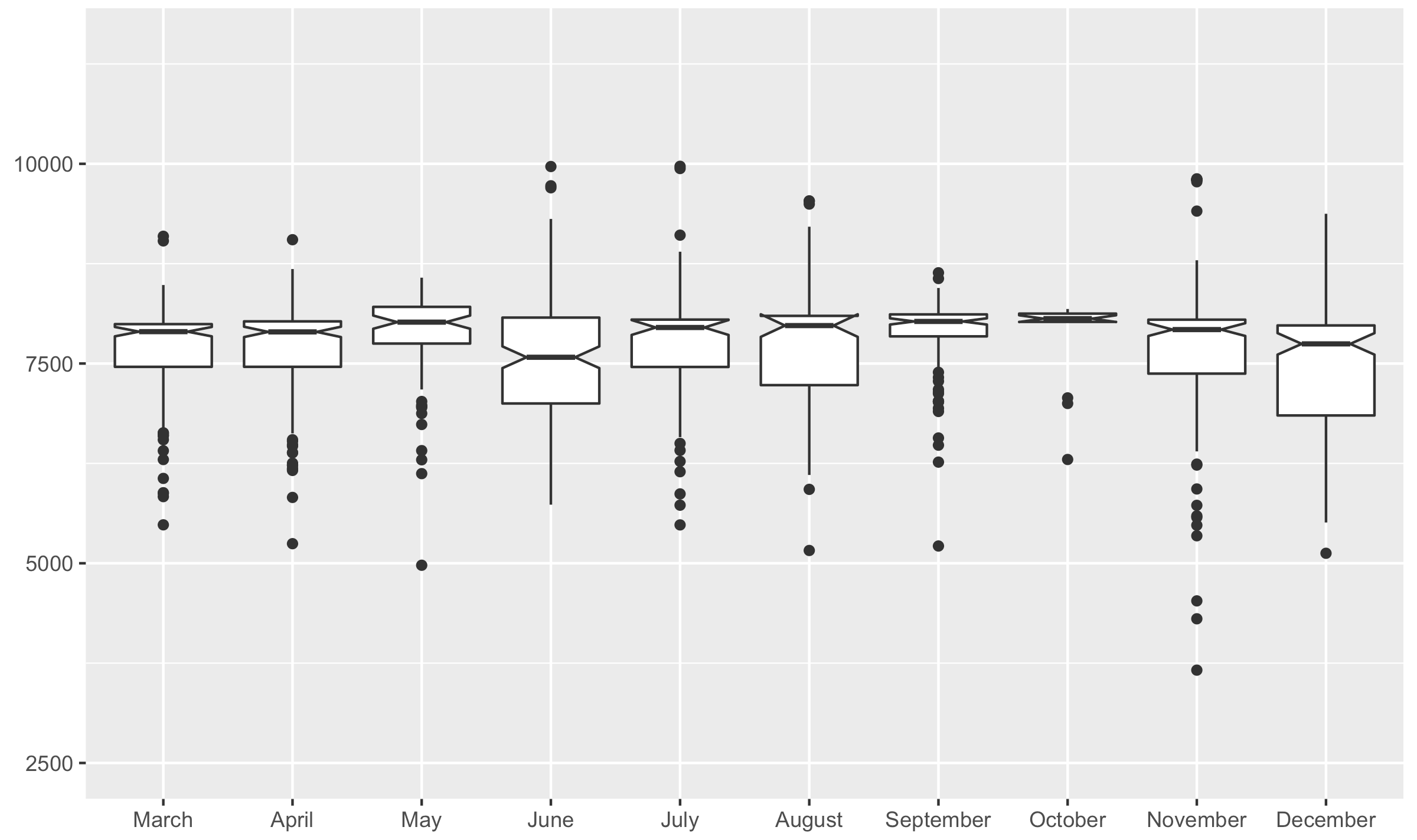
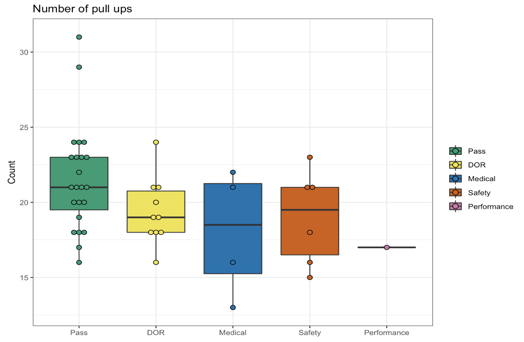
Boxplot or box-and-whisker plot [Tuckey 1969]
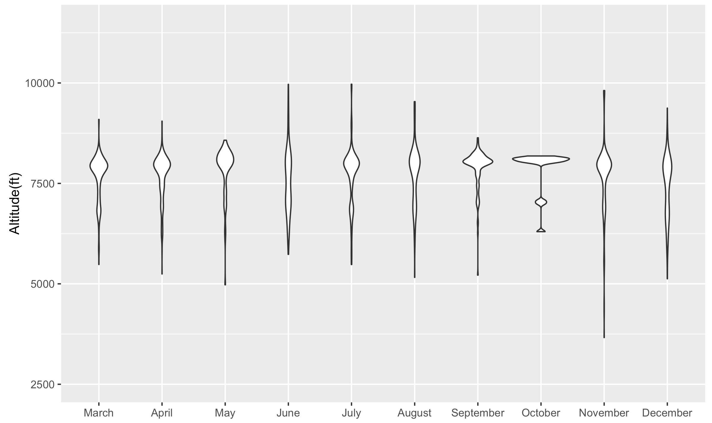
Quartiles, distribution skewness, tails, outliers (not modes: unimodal distribution)
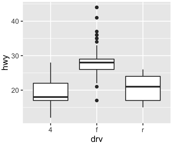
Boxplot anatomy
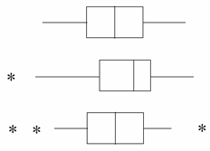
normal distribution
left skewed
centered with outliers
Frequency distribution table
Often shown with ordered data, relative frequency and cumulative frequency
| Chol. (mg/dl) | No. | Rel. Freq. | Cum. Freq. |
|---|---|---|---|
| 80-119 | 13 | 1.2 | 1.2 |
| 120-159 | 150 | 14.1 | 15.3 |
| 160-199 | 442 | 41.4 | 56.7 |
| 200-239 | 299 | 28.0 | 84.7 |
| 240-279 | 115 | 10.8 | 95.5 |
| 280-319 | 34 | 3.2 | 98.7 |
| 320-359 | 9 | 0.8 | 99.5 |
| 360-399 | 5 | 0.5 | 100.0 |
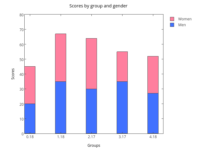
Bar charts of frequencies
Bars separation used to imply discontinuity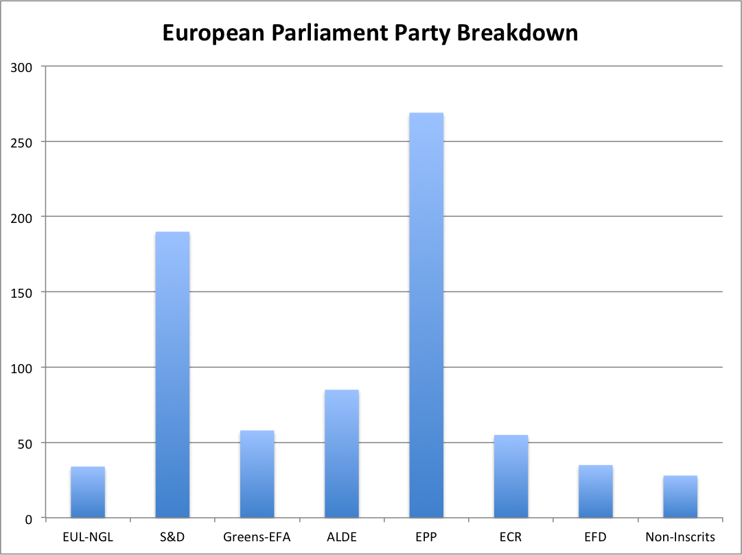
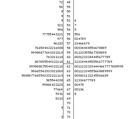
Stem-and-leaf plot
Shows the data and data distribution (skewness, modes, tails, outliers)
Steps to build a stem-and-leaf plot
73, 42, 67, 78, 99, 84, 91, 82, 86, 122
- Order in ascending order
42, 67, 73, 78, 82, 84, 86, 91, 99, 122 - Select stem and leaf
42, 67, 73, 78, 82, 84, 86, 91, 99, 122 - Plot
								 4 | 2
								 5 |
								 6 | 7
								 7 | 38
								 8 | 246
								 9 | 19
								10 |
								11 |
								12 | 2
4 | 2 6 | 738 8 | 24619 10 | 12 | 2Half the size
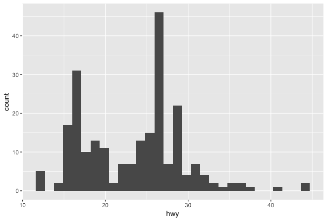
Histogram [Pearson 1895]
Shows skewness, modes, tails, outliers
- Bar graph of frequencies for ordered, equal size bins
- Bars touch to imply continuity of bins
- Need to experiment with the bin size
Steps to build an histogram
73, 42, 67, 78, 99, 84, 91, 82, 86, 122
- Order in ascending order
42, 67, 73, 78, 82, 84, 86, 91, 99, 122 - Select bin size
range = max - min = 122 - 42 = 80 bin size 20 bin size 40 - Create a frequency table
Interval Frequency 40-60 1 60-80 3 80-100 5 100-120 0 120-140 1 Bin size 20 Interval Frequency 40-80 4 80-120 5 120-140 1 Bin size 40 - Plot
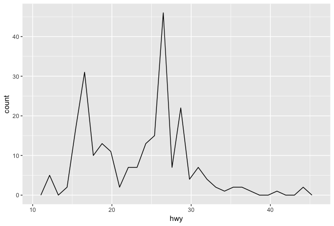
Frequency polygon
Shows skewness, modes, tails, outliers
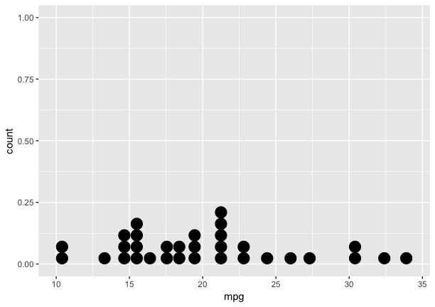
Dot plot histogram
Popular statistical analysis graphics
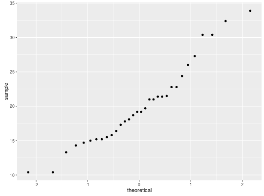
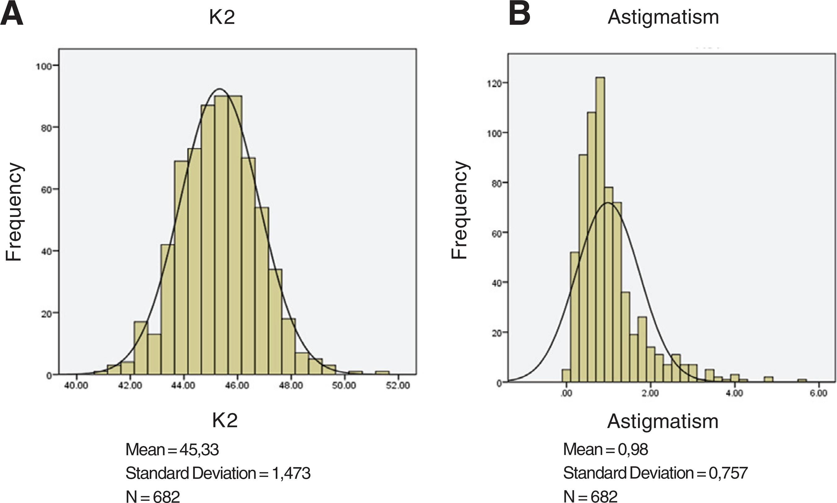
Visualizing normality: Q-Q plot and histograms
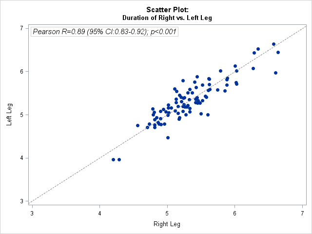
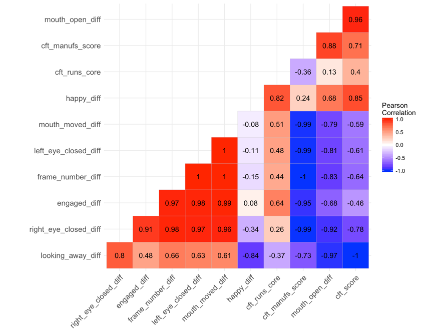
Visualizing correlations: scatterplots and heatmaps
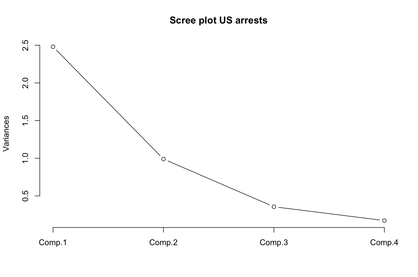
Visualizing PCA Results
Scree plot
Biplot [Gabriel 71]
Visualizing hierarchical clustering results
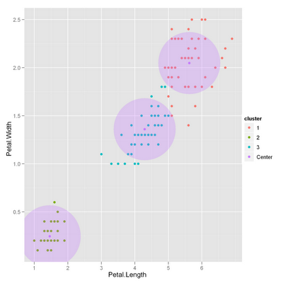
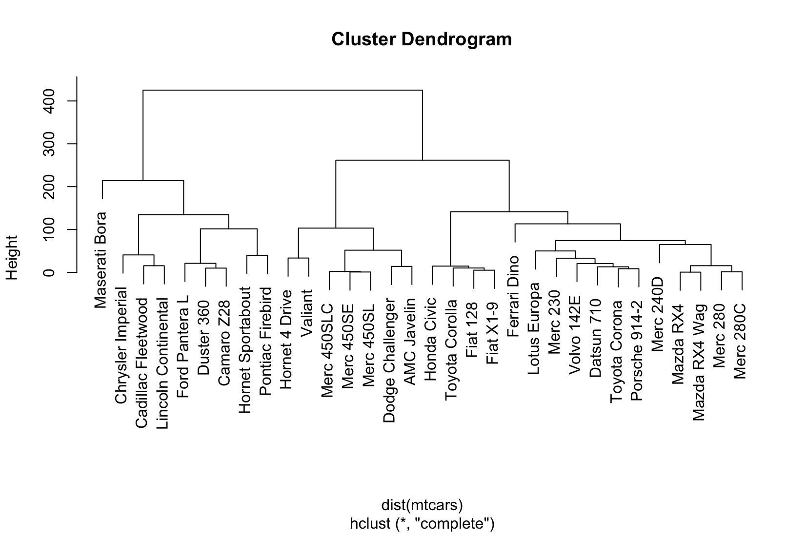
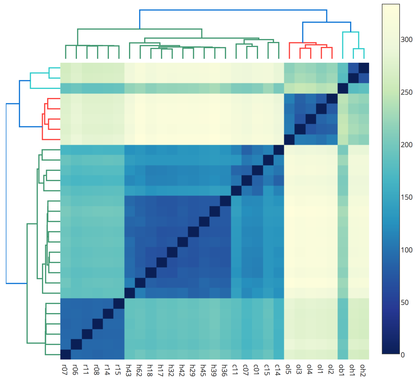
Combination Plot (Combo plot)
Visualizing model performance
Supervised learning
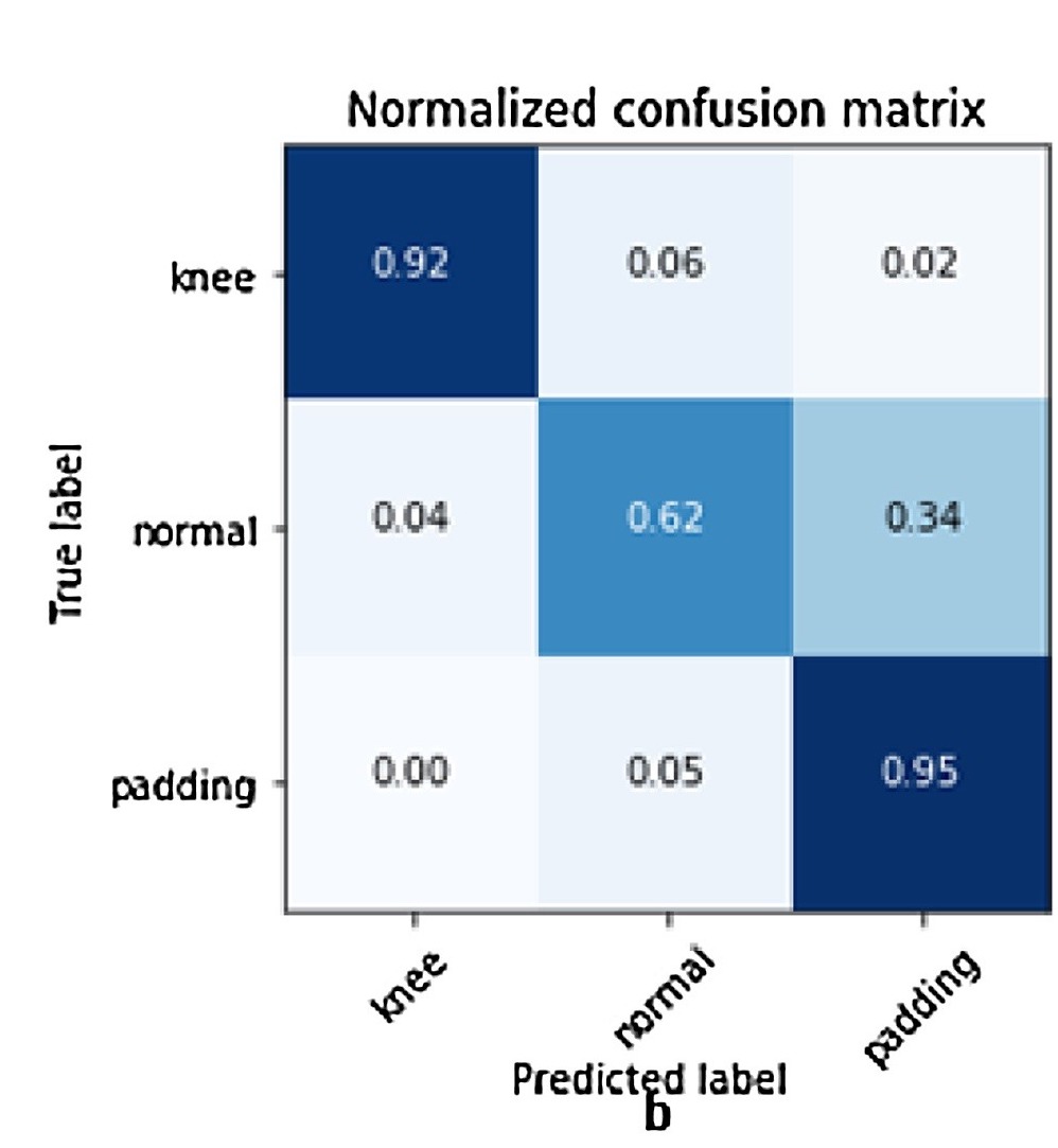
Confusion matrix
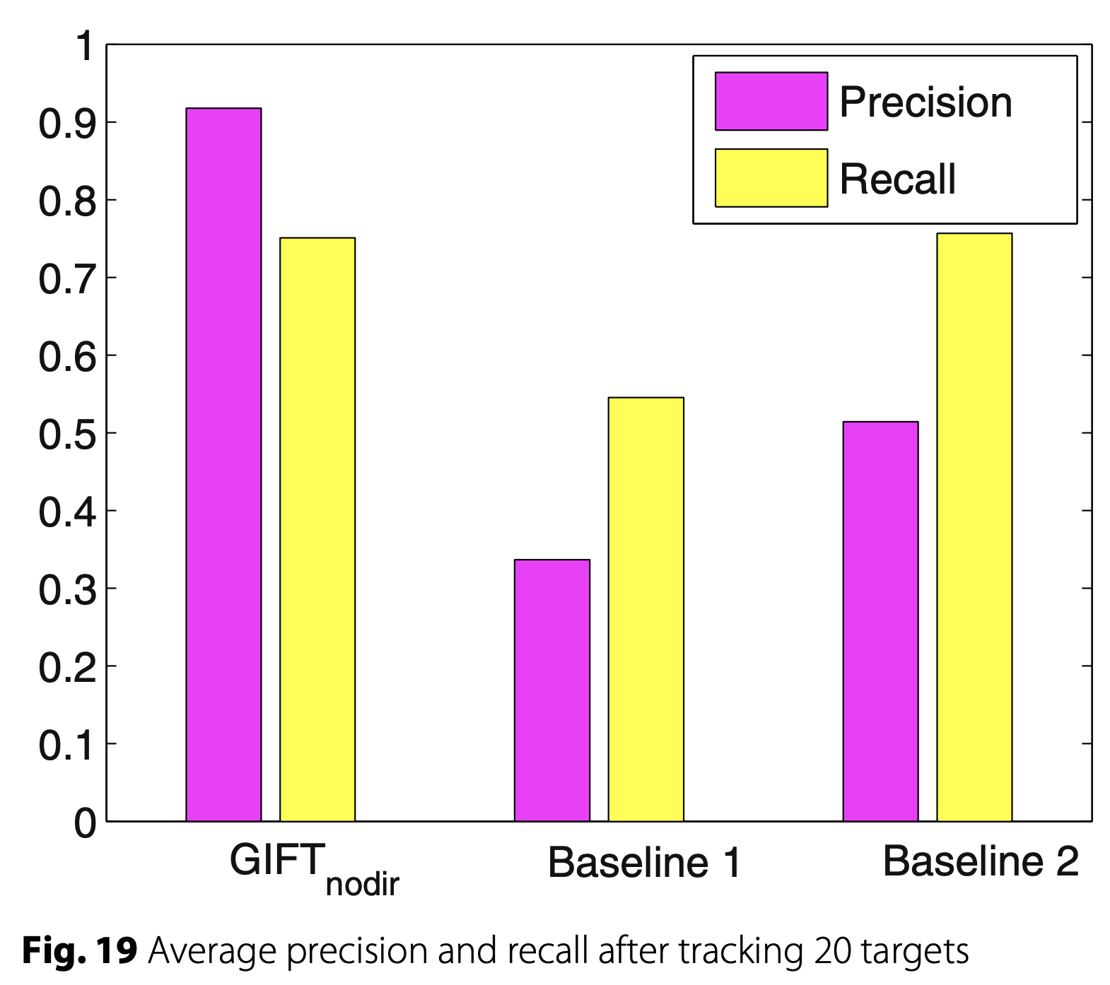
Precision and Recall
Specificity and Sensitivity
Visualizing the Confusion matrix: table and heatmap
									# d1:  Int. Derang. (DDWR)  /  Int. Derang. (eDDNR)
									 No Yes
									188 112

									Call:
									 randomForest(formula = target, data = df, proximity = TRUE)
													 Type of random forest: classification
														 Number of trees: 500
									No. of variables tried at each split: 11

											OOB estimate of  error rate: 3%
									Confusion matrix:
											No  Yes class.error
									No  187   1 0.005319149
									Yes   8 104 0.071428571
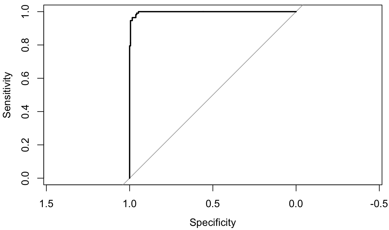
Visualizing the ROC* curve: line chart
Bars to compare conditions/classifiers
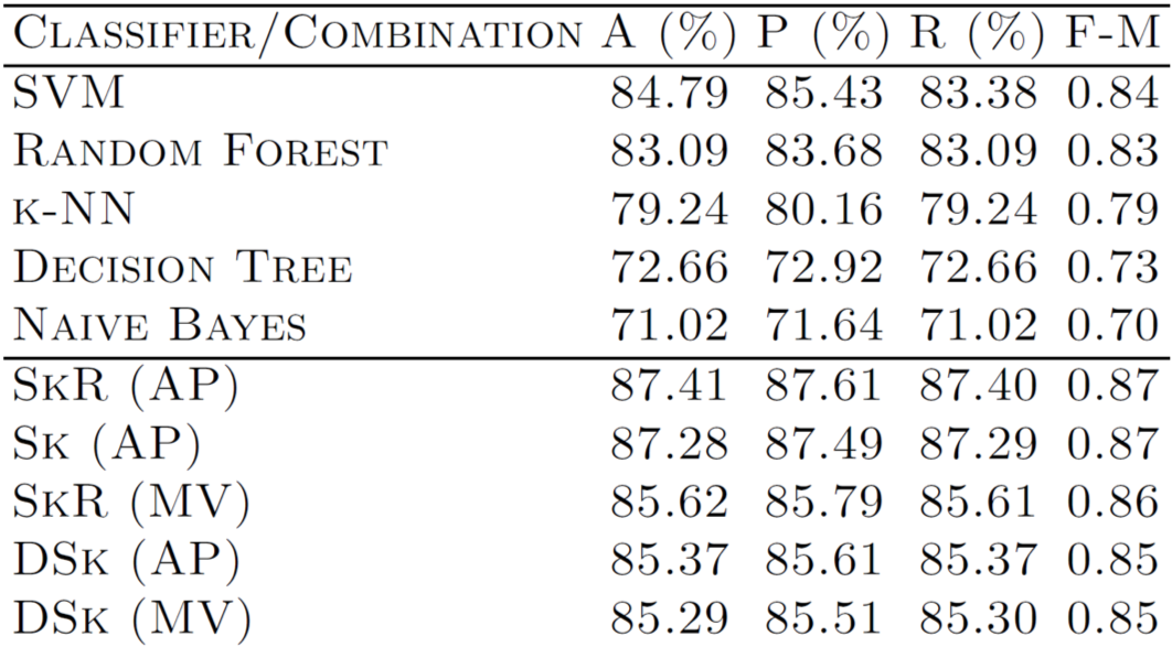
Tables to compare conditions/classifiers
$$ \text{Precision} = \frac{TP} {TP + FP}$$
$$ \text{Recall} = \frac{TP} {TP + FN}$$
$$ \text{Accuracy} = \frac{TP + TN} {TP + TN + FP + FN}$$
$$ F_1 \text{score} = 2 \cdot \frac{\text{precision} \cdot \text{sensitivity}}{\text{precision} +
\text{sensitivity}}$$


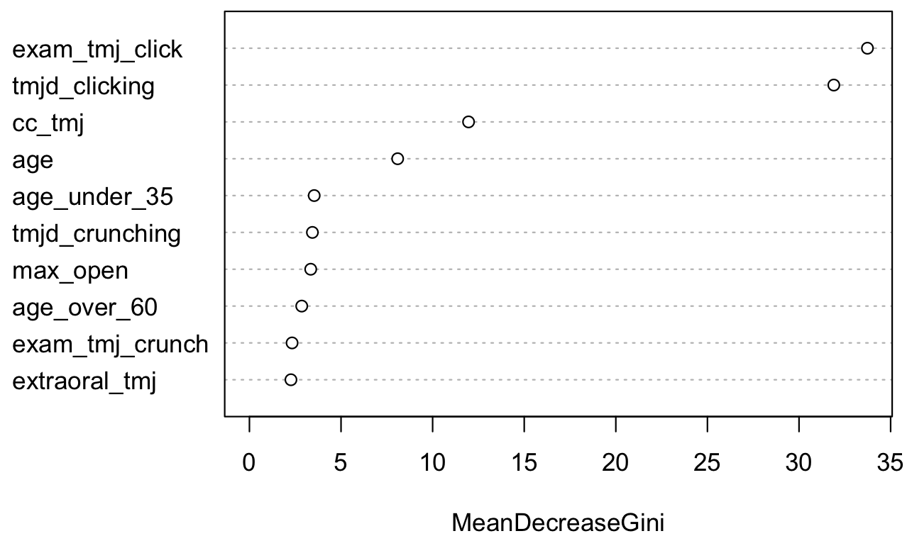
Visualizing feature importance: table and Dot plot
								# d1:  Int. Derang. (DDWR)  /  Int. Derang. (eDDNR)
								 No Yes
								188 112

								Call:
								 randomForest(formula = target, data = df, proximity = TRUE)
											   Type of random forest: classification
													 Number of trees: 500
								No. of variables tried at each split: 11

										OOB estimate of  error rate: 3%
								Confusion matrix:
								    No  Yes class.error
								No  187   1 0.005319149
								Yes   8 104 0.071428571

								Top 10 variables
								   No    Yes
								1  0.990 0.010
								2  0.988 0.012
								3  0.992 0.008
								4  0.108 0.892
								5  0.970 0.030
								6  0.990 0.010
								7  0.962 0.038
								8  0.040 0.960
								9  0.986 0.014
								10 0.042 0.958
								Setting levels: control = No, case = Yes
								Setting direction: controls < cases
								Area under the curve: 0.9974
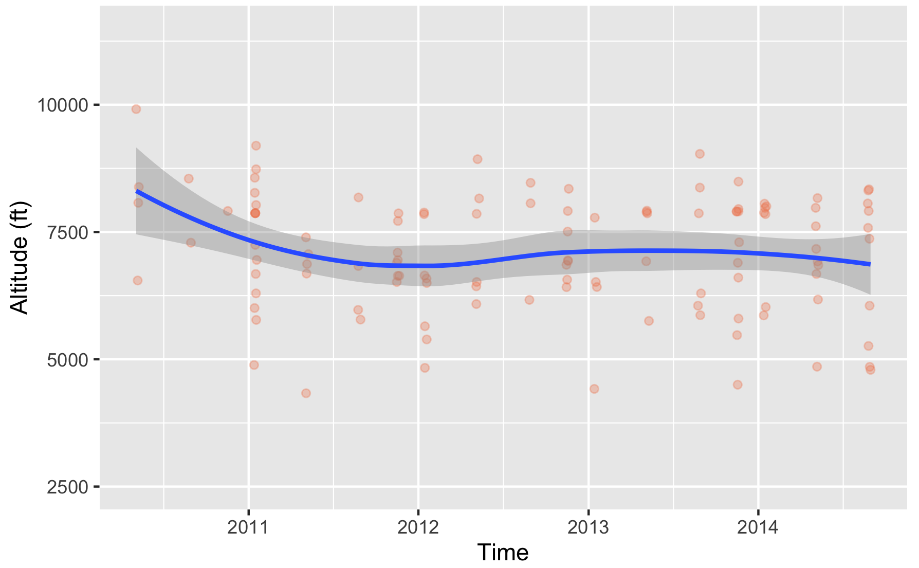
Visualizing Regression models: line chart with Ribbon
Design considerations for statistical graphics
Choose encodings wisely
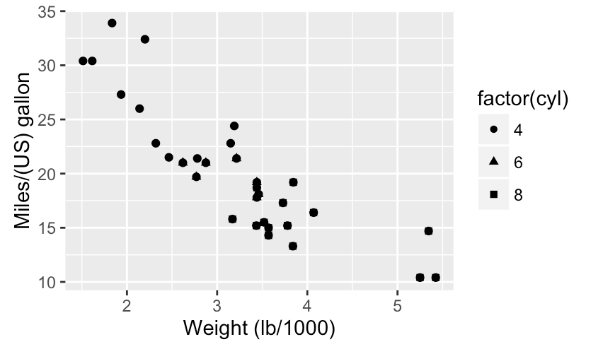
Color & shape work well with categorical variables
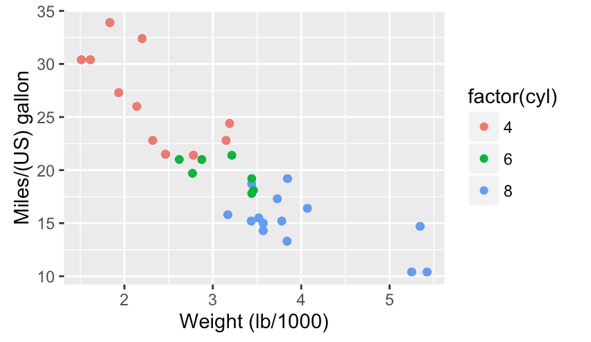
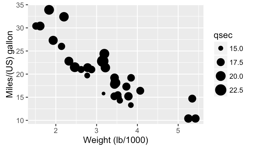
Size works well with continuous variables
Series work better than complex plots
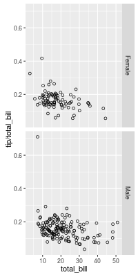
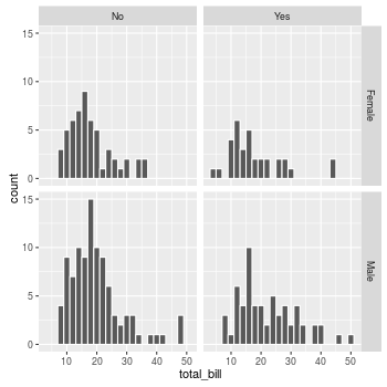
Faceting/conditioning/latticing/trellising/small multiples
Ways to deal with overplotting
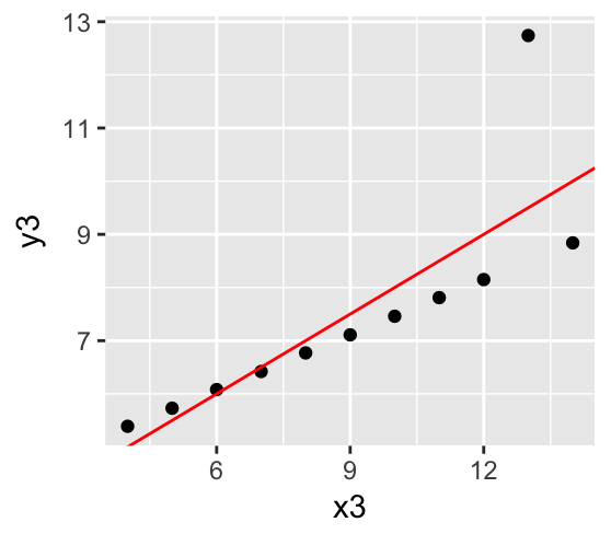
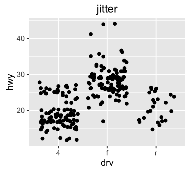


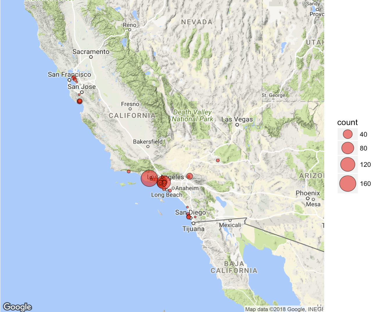
Outline
- Basics of statistics and modeling
- Statistical graphics
- Tools
Visualization tools
Dataframe
- Table with same length columns
- Columns are variables
- Rows are observations
- Strings can be stored as factors
					> df <- sample_n(mpg, 36)
					> df$manufacturer <- factor(df$manufacturer)
					> df
					# A tibble: 36 x 11
						manufacturer model              displ  year   cyl trans      drv     cty   hwy fl    class
						<fct>        <chr>              <dbl> <int> <int> <chr>      <chr> <int> <int> <chr> <chr>
						1 toyota       camry                2.4  2008     4 auto(l5)   f        21    31 r     midsize
						2 toyota       camry solara         2.4  2008     4 manual(m5) f        21    31 r     compact
						3 dodge        dakota pickup 4wd    4.7  2008     8 auto(l5)   4         9    12 e     pickup
						4 chevrolet    corvette             5.7  1999     8 auto(l4)   r        15    23 p     2seater
						5 audi         a4                   1.8  1999     4 manual(m5) f        21    29 p     compact
						6 jeep         grand cherokee 4wd   4.7  1999     8 auto(l4)   4        14    17 r     suv
						7 hyundai      tiburon              2    1999     4 manual(m5) f        19    29 r     subcompact
						8 dodge        dakota pickup 4wd    3.9  1999     6 manual(m5) 4        14    17 r     pickup
						9 toyota       camry solara         3    1999     6 auto(l4)   f        18    26 r     compact
					10 ford         expedition 2wd       4.6  1999     8 auto(l4)   r        11    17 r     suv
					# ... with 26 more rows
					> summary(df$manufacturer)
					audi  chevrolet      dodge       ford      honda    hyundai       jeep land rover
						3          2          5          5          2          2          2          1
					nissan    pontiac     subaru     toyota volkswagen
						2          1          1          7          3
 Granite Granite |
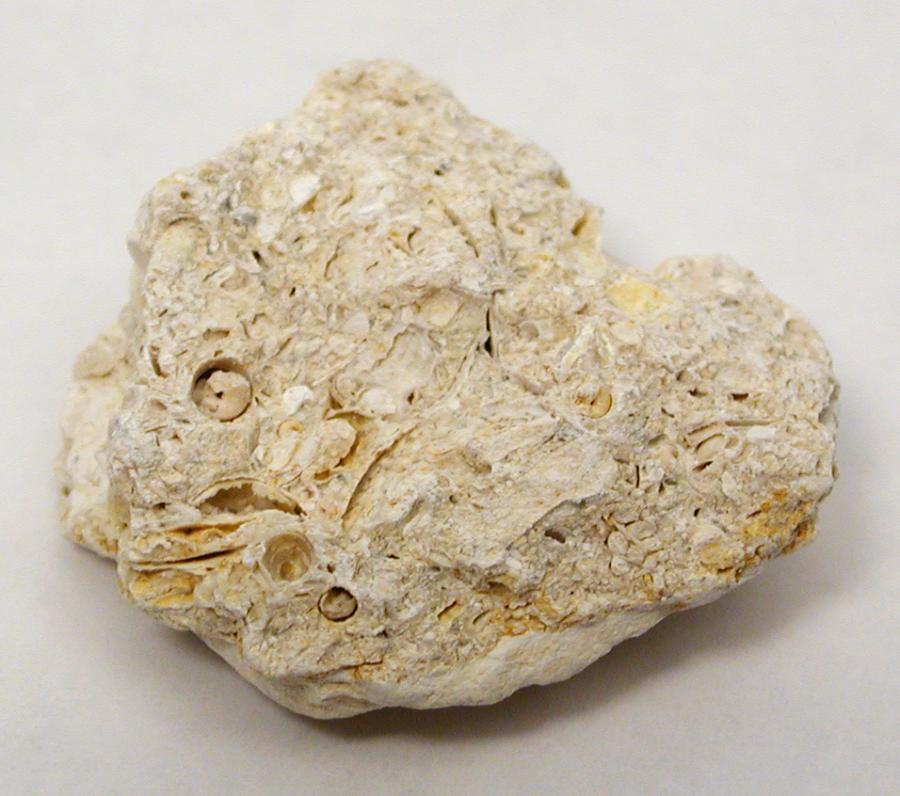 Limestone Limestone |
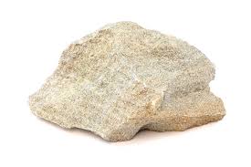 Sandstone Sandstone |
|
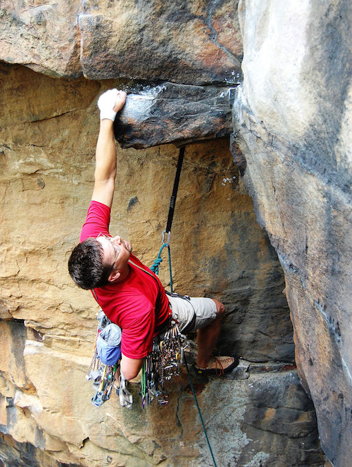 Trad Trad |
36 | 0 | 52 |
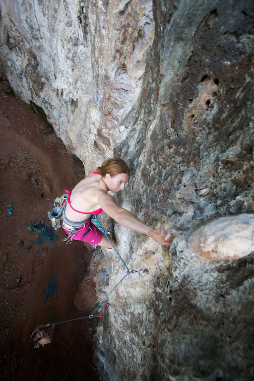 Sport Sport
|
76 | 8 | 41 |
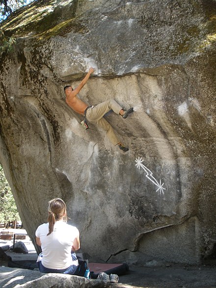 Bouldering Bouldering |
102 | 0 | 13 |
| rock | type | count |
|---|---|---|
| Granite | Trad | 36 |
| Granite | Sport | 76 |
| Granite | Bouldering | 102 |
| Limestone | Trad | 0 |
| Limestone | Sport | 8 |
| Limestone | Bouldering | 0 |
| Sandstone | Trad | 52 |
| Sandstone | Sport | 41 |
| Sandstone | Bouldering | 13 |
Matplotlib
- http://matplotlib.org and gallery
- Chart typology
- Originally emulating the MATLAB® graphics commands
- Imperative (functional) programming
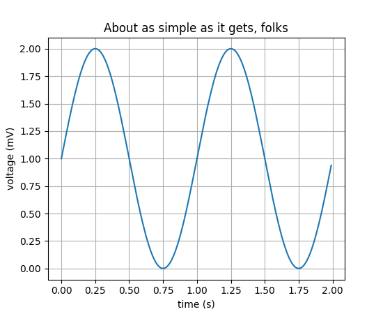
						import matplotlib.pyplot as plt
						import numpy as np

						T = np.arange(0.0, 2.0, 0.01)
						S = 1 + np.sin(2*np.pi*t)

						plt.plot(T, S)
						plt.xlabel('time (s)')
						plt.ylabel('voltage (mV)')
						plt.title('About as simple as it gets, folks')
						plt.grid(True)

						plt.show()
Seaborn
- https://seaborn.pydata.org and gallery
- Chart typology
- High-level interface for statistical graphics based on Matplotlib
- Imperative (functional) programming
- Support for Pandas dataframes
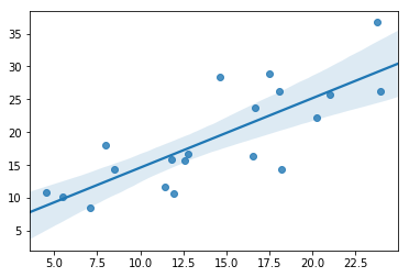
							import numpy as np
							import seaborn as sns

							x = 5 + np.arange(20) +
							    np.random.randn(20)
							y = 10 + np.arange(20) +
								5 * np.random.randn(20)

							sns.regplot(x, y)
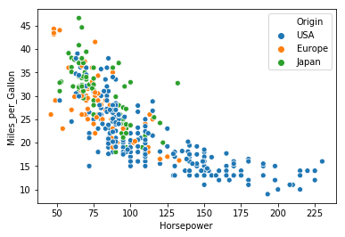
					  Acceleration Cylinders  Displacement Horsepower Miles_per_Gallon Name                      Origin Weight_in_lbs Year
					0 12.0         8          307.0        130.0      18.0             chevrolet chevelle malibu USA    3504          1970-01-01
					1 11.5         8          350.0        165.0      15.0             buick skylark 320         USA    3693          1970-01-01
					2 11.0         8          318.0        150.0      18.0             plymouth satellite        USA    3436          1970-01-01
					3 12.0         8          304.0        150.0      16.0             amc rebel sst             USA    3433          1970-01-01
					4 10.5         8          302.0        140.0      17.0             ford torino               USA    3449          1970-01-01
						...
							import seaborn as sns
							from vega_datasets import data

							cars = data.cars()
							sns.scatterplot(
								x='Horsepower',
								y='Miles_per_Gallon',
								hue='Origin',
								data=cars);
ggplot2
- ggplot2 R package and ggg gallery
- Visual Analysis Grammar
- Support for R dataframes
							mpg cyl disp  hp drat    wt  qsec vs am gear carb
							Mazda RX4      21.0 6 160.0 110 3.90 2.620 16.46  0  1    4    4
							Mazda RX4 Wag  21.0 6 160.0 110 3.90 2.875 17.02  0  1    4    4
							Datsun 710     22.8 4 108.0  93 3.85 2.320 18.61  1  1    4    1
							...
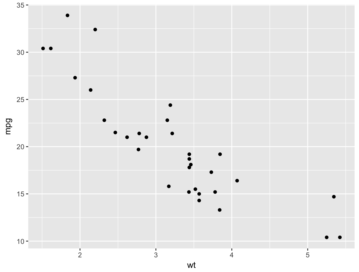
							#ggplot(Data, Mapping) + Geom
							ggplot(mtcars, aes(x=wt, y=mpg)) + geom_point()
plotnine
- Plotnine website and gallery
- Visual Analysis Grammar
- Based on ggplot2 for Python
- Support for Pandas dataframes
							               mpg cyl disp  hp drat    wt  qsec vs am gear carb
							Mazda RX4      21.0 6 160.0 110 3.90 2.620 16.46  0  1    4    4
							Mazda RX4 Wag  21.0 6 160.0 110 3.90 2.875 17.02  0  1    4    4
							Datsun 710     22.8 4 108.0  93 3.85 2.320 18.61  1  1    4    1
							...
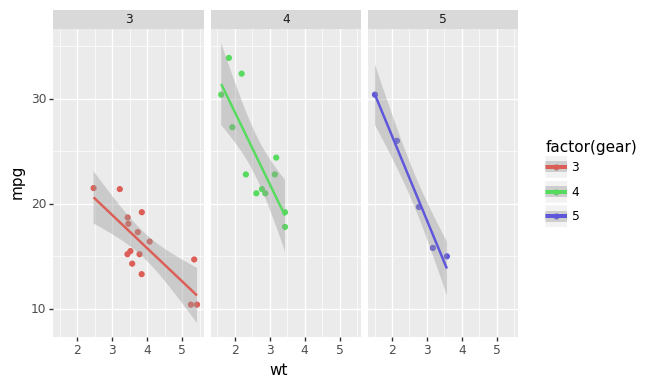
							(ggplot(mtcars, aes('wt', 'mpg', color='factor(gear)'))
							+ geom_point()
							+ stat_smooth(method='lm')
							+ facet_wrap('~gear'))
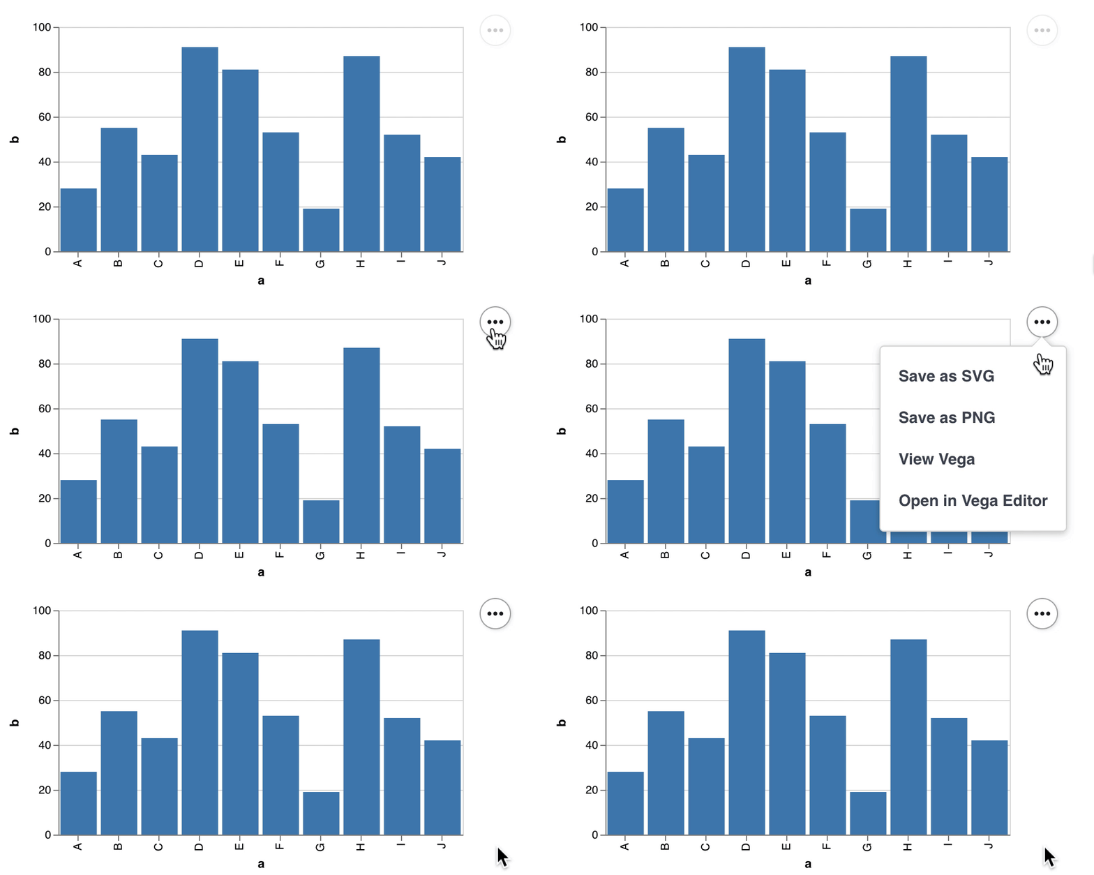
Altair
- Altair website and gallery
- Visual Analysis Grammar
- Declarative synthax
- Statistical visualization library
- Based on Vega and Vega-Lite
- Support for Pandas dataframes
								import altair as alt

								# load a simple dataset as a pandas DataFrame
								from vega_datasets import data
								cars = data.cars()

								alt.Chart(cars).mark_point().encode(
								  x='Horsepower',
								  y='Miles_per_Gallon',
								  color='Origin',
								).interactive()
Components of the Grammar of graphics*
Graphic defined by a grammar of components

- DATA: a set of data operations that create variables from datasets,
- TRANS: variable transformations, e.g., rank,
- SCALE: scale transformations, e.g., log,
- COORD: a coordinate system, e.g., polar,
- ELEMENT: graphs, e.g., points, and their aesthetic attributes, e.g., color,
- GUIDE: one or more guides, e,g., axes, legends.
Layered Grammar of Graphics* [Wickham 2010]
| Defaults
Data
Mapping** |
A default dataset and set of mappings from variables to aesthetics |
| Layer
Data
Mapping Geom Stat Position |
One or more layers, each composed of a geometric object, a statistical transformation, a position adjustment, and optionally, a dataset and aesthetic mappings |
| - Coord - Facet |
A coordinate system The facetting specification |
Minimal ggplot2 plot
3 components required in every ggplot2 plot: data, aesthetic mapping, Geom
Defaults
Layer
Coord
Facet
Data
Mapping
Mapping
Layer
Data
Mapping
Geom
Stat
Position
ScaleMapping
Geom
Stat
Position
Coord
Facet
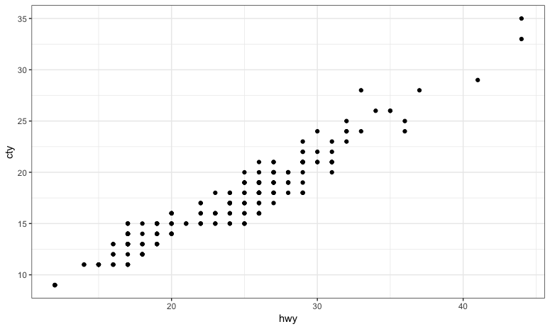
							ggplot(data=mpg, aes(x=hwy, y=cty)) + geom_point() #Defaults
							ggplot(mpg, aes(hwy, cty)) + geom_point() #positional args
							ggplot(mpg) + geom_point(aes(hwy, cty))  #Mapping in layer

							# Same using a variable
							p <- ggplot(mpg, aes(hwy, cty))  #set Defaults
							p + geom_point()  #add Layer with Geom
aes() references variables in the dataframe
					# mtcars dataset:
					                    mpg  cyl  disp  hp drat    wt  qsec vs am gear carb
					Mazda RX4           21.0   6 160.0 110 3.90 2.620 16.46  0  1    4    4
					Mazda RX4 Wag       21.0   6 160.0 110 3.90 2.875 17.02  0  1    4    4
					Datsun 710          22.8   4 108.0  93 3.85 2.320 18.61  1  1    4    1

					aes(x = mpg, y = wt)
					#> Aesthetic mapping:
					#> * `x` -> `mpg`
					#> * `y` -> `wt`

					# You can also map aesthetics to functions of variables
					aes(x = mpg ^ 2, y = wt / cyl)
					#> Aesthetic mapping:
					#> * `x` -> `mpg^2`
					#> * `y` -> `wt/cyl`

					# Or to constants
					aes(x = 1, colour = "smooth")
					#> Aesthetic mapping:
					#> * `x`      -> 1
					#> * `colour` -> "smooth"
Aesthetics Mappings
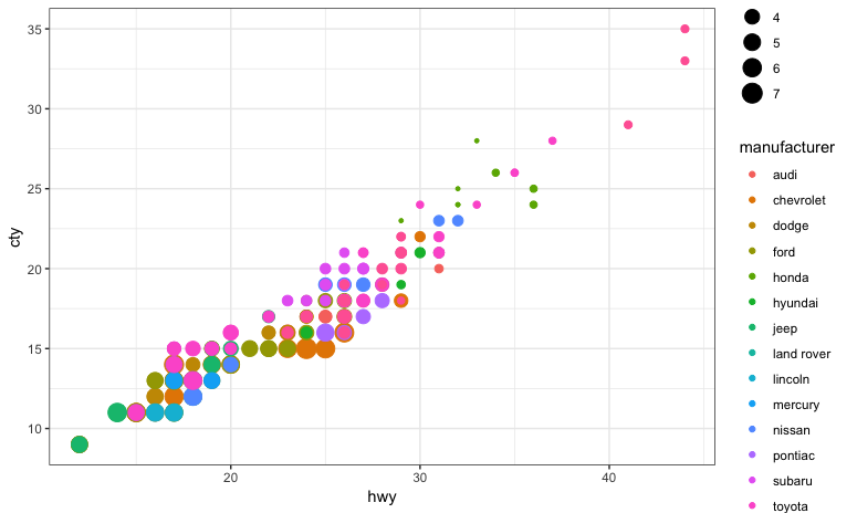
					ggplot(mpg, aes(x=hwy, y=cty, color=manufacturer, size=displ)) + geom_point()  #x, y
					ggplot(mpg, aes(hwy, cty, color=manufacturer, size=displ)) + geom_point()  #color
					ggplot(mpg, aes(hwy, cty), color=manufacturer, size=displ) + geom_point()  #bad

					ggplot(mpg, aes(hwy, cty, col=manufacturer, size=displ)) + geom_point()  #col
					ggplot(mpg, aes(hwy, cty, colour=manufacturer, size=displ)) + geom_point()  #colour

					ggplot(mpg, aes(hwy, cty)) + geom_point(aes(color=manufacturer, size=displ))
					ggplot(mpg, aes(hwy, cty)) + geom_point(color=manufacturer, size=displ)  #bad!
Adding layers
Defaults
Layer
Coord
Facet
Data
Mapping
Mapping
Layer
Data
Mapping
Geom
Stat
Position
ScaleMapping
Geom
Stat
Position
Coord
Facet
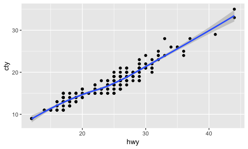
							> ggplot(mpg, aes(hwy, cty)) +  #Defaults
							  geom_point() +  #add Geom point Layer
							  geom_smooth()  #add Geom smooth Layer (regression)
Basic named plots
All understand x, y, color and size aesthetics.
Filled geoms also understand fill.
| Scatterplot | geom_point() |
| Text | geom_text() |
| Bar chart | geom_bar() |
| Line chart | geom_line() |
| Area chart | geom_area() |
| Dot plot | geom_dotplot() |
| Histogram | geom_histogram() |
| Frequency polygon | geom_freqpoly() |
| Box plot | geom_boxplot() |
| Violin plot | geom_violin() |
$$y \sim x$$
tilde Operatorseparates the left- and right-hand sides
					# Multiple linear regression
					fit <- lm(y ~ x1 + x2 + x3, data=mydata)
					summary(fit) # show results
Faceting
t <- ggplot(mpg, aes(cty, hwy)) + geom_point()
| New notation | Old formula interface* | |
|---|---|---|

|
|
|

|
|
|

|
|
|

|
|
|
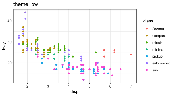
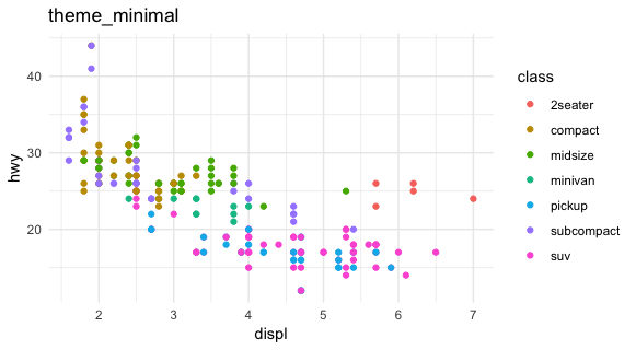
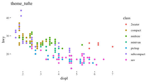
Default themes and extra themes
				p <- ggplot(mpg, aes(displ, hwy, color=class)) + geom_point()
				p + theme_bw() + ggtitle("theme_bw")
				p + theme_minimal() + ggtitle("theme_minimal")

				library(ggthemes)  #extra themes
				p + theme_tufte() + ggtitle("theme_tufte")

				theme_set(theme_bw())  #sets the theme for all subsequent ggplot plots
GGPLOT 2 layered grammar
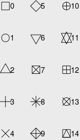
ggplot(iris, aes(x=Sepal.Length, y=Sepal.Width, color=Species, size=Petal.Length)) + geom_point()
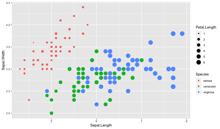
geom_point(shape=1) to draw circle outlineTableau visual grammar
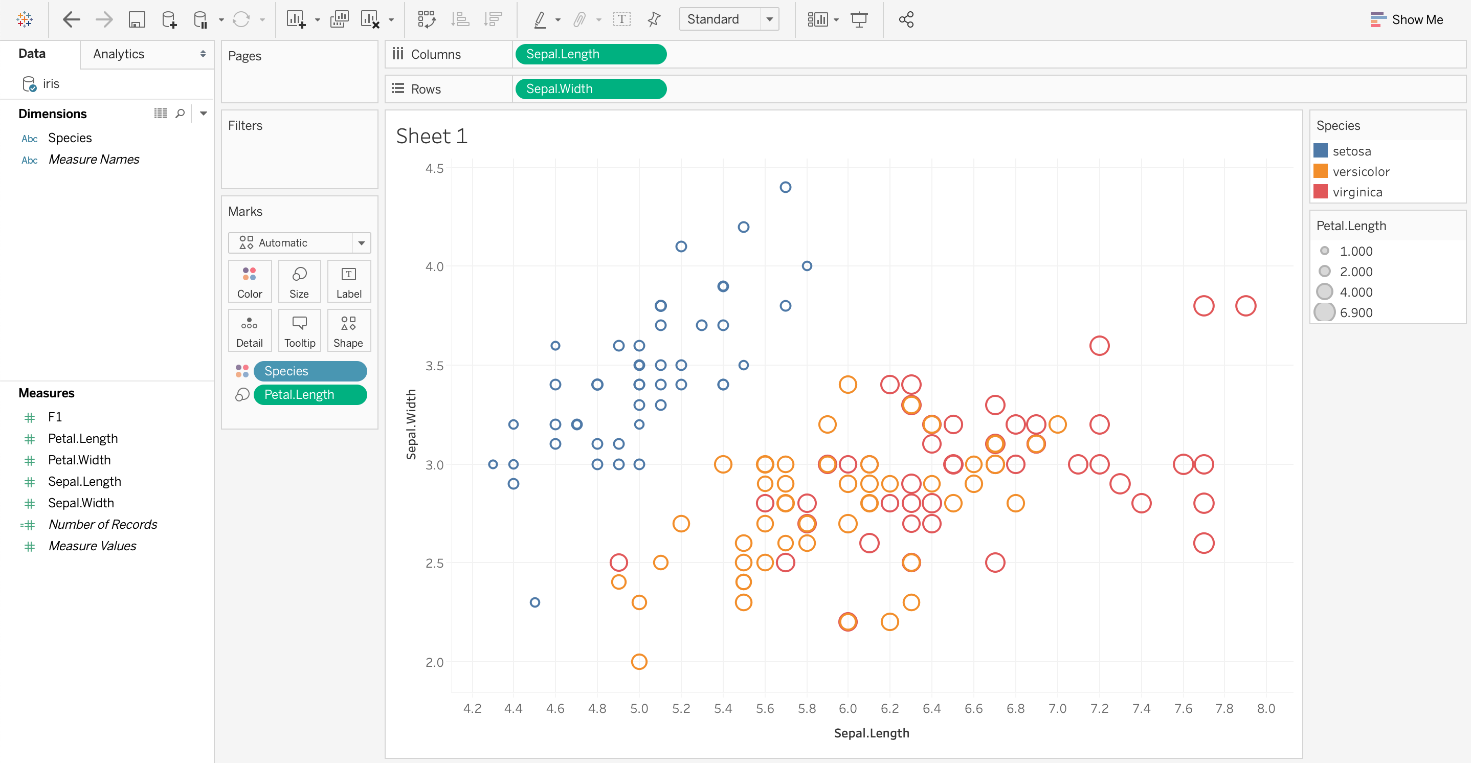
Dimensions ↔ categorical visual variables
Measures ↔ numerical visual variables
Tableau vs. GGPLOT2
x ↔ Columny ↔ Rows