DSCI 554 lecture 1
Course overview, introduction to data visualization
Dr. Luciano Nocera

Outline
- Course information
- Data visualization
- Examples and uses
- Tools and software
Course Objective
- Learn design principles and guidelines
- Learn to critique and evaluate visualizations
- Understand visualization tools and techniques
- Learn how to create interactive visualizations
Course Materials
http://pdms.usc.edu/dsci-554
Quizzes 20%
Homework Assignments 30%
Projects 30%
Final Exam 20%
Homework Assignments 30%
Projects 30%
Final Exam 20%
Quizzes
- 20% of grade
- 20min
- On previous class content & readings
- The worst quiz score will not count. No retake!
- MCQ
- Some coding questions
Homework
- 30% of grade
- 1-4 hours to complete
- One week to complete
- In GitHub using your USC email!
- See rubric in starter repositories for more details
Final Exam
- 20% of grade
- Cumulative
- Quiz questions
- According to University schedule:
https://classes.usc.edu/term-20213/finals/
Classes meeting 2 or 2:30 MWF Friday, December 10, 2-4 p.m.
Projects
- 30% of grade
- Groups of 3-4: start to form groups!
- Design and implement interactive, responsive data visualizations (e.g., dashboard)
- Website, video, paper and presentation
Class communication
On Slack at #fall21-dsci-554-generalRequired readings
† online through USC Libraries Other related readings
† online through USC Libraries Outline
- Course information
- Data visualization
- Examples and uses
- Tools and software
Data visualization
Data visualization
DIKW Model [Ackoff 1989]
Data visualization
Data
The Griffith Observatory is open Tuesday to Friday during 12:00 noon - 10:00 p.m., admission to building and grounds is always FREE.
Information
The Griffith Observatory is open Tuesday to Friday during 12:00 noon - 10:00 p.m., admission to building and grounds is always FREE.
Knowledge
It is best to visit the Griffith Observatory weekdays before 4 p.m., because it is less crowded.
Wisdom
To go from USC Park Campus to the Griffith Observatory at this time takes 45 min with traffic.
Data visualization in data science
Data science process flowchart Units of data & information
1 byte = 8 bits
Ex: ASCII characters encoded using 1 byte: $2^8 = 256$ possible values Multiples of bytes Decimal Value Metric 1000 kB kilobyte 10002 MB megabyte 10003 GB gigabyte 10004 TB terabyte 10005 PB petabyte 10006 EB exabyte 10007 ZB zettabyte 10008 YB yottabyte Binary Value IEC 1024 KiB kibibyte 10242 MiB mebibyte 10243 GiB gibibyte 10244 TiB tebibyte 10245 PiB pebibyte 10246 EiB exbibyte 10247 ZiB zebibyte 10248 YiB yobibyte Prefix Symbol Associated Value Tera Tera is derived from Greek word τέρας teras, meaning monster - think four (e.g., tetrapod)T 4 Peta Peta is derived from the Greek πέντε, meaning five (e.g., pentagram)P 5 Exa Exa comes from the Greek ἕξ, used as a prefix ἑξά-, meaning six (e.g., hexagone)E 6 Zetta Zetta was formed from the Greek ἑπτά, (hepta), also meaning sevenZ 7 Yotta Yotta is derived from the Greek οκτώ (októ), meaning eightY 8 💡 Convert between metric values using powers of kilobytes (kB)Ex: $ 1 \text{PB} = 1000^{5} \text{bytes} = 10^{15} \text{bytes} $ Astronomers expect to be processing 10 petabytes of data every hour from the Square Kilometer Array (SKA) telescope.- How many 1TB drives would be filled in a day?
- How many days would it take to collect one exabyte?
- How may zettabytes would be collected in a year?
1. 240000 drives \[ 1 \text{PB} = 10^{15} \text{bytes} = 10^3 \times 10^{12} \text{bytes} = 10^3 \text{TB} \\ 10 \text{PB} \times 24 \text{h} = 24 x 10 \times 10^3 \text{TB} = 240 000 \times 1 \text{TB drives} \] 2. About 4 days \[ 24 \text{PB} \times x = 1 \text{EB} \Rightarrow 24 \times 10^{16} \times x = 10^{18} \Rightarrow x = 100/24 \simeq 4 \text{days} \] 3. About 0.1 ZB/year \[ 1ZB = 10^{21} \text{bytes} \\ 365 \times 24 \times 10 \text{PB} = 365 \times 24 \times 10^{16} \simeq 10^4 \times 10^{16} \simeq 10^{20} bytes \simeq 0.1 \text{ZB} / \text{year} \]Data visualization
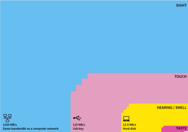 Nørretranders bandwidth of senses Graphic by David McCandless
Data visualization refers to the techniques used to communicate data or information by encoding it as visual objects (e.g., points, lines or bars) contained in graphics. The goal is to communicate information clearly and efficiently to users. It is one of the steps in data analysis or data science. [Wikipedia]
Information visualization is the study of (interactive) visual representations of abstract data to reinforce human cognition. [Wikipedia]

Nørretranders bandwidth of senses - Graphic by David McCandless You are aware of 0.7% of what you experience:- High-res limited to central 3° of visual field
- Finite cognitive capabilities
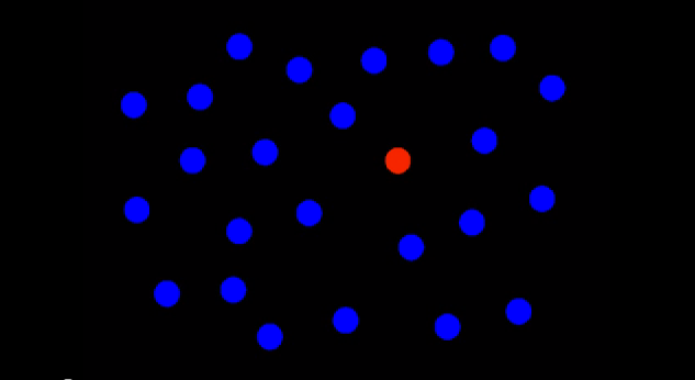
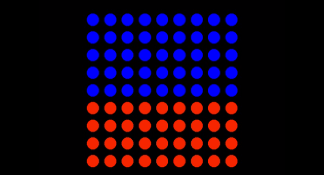
Preattentive features (universal capability)
- Typically in less than 1/10s
- Does not require eye movements
- Does not require focused attention
- Color and boundary can be detected preattentively
Other examples of universal capabilities:- Some color combinations are differentiated by everyone
- Some symbols are understood across cultures 🙂
Color interpretation (individual capability)
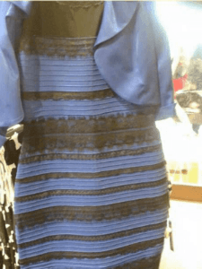
https://en.wikipedia.org/wiki/The_dress - We interpret lighting differently
- Not everyone can differentiate certain colors
- Not everyone understands certain symbols ♸
- Not everyone can read or read small text!
Information vs. scientific visualization
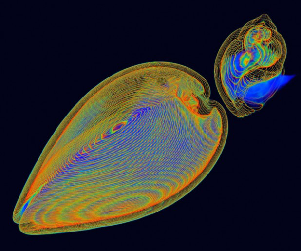
Infovis Scivis Representation chosen given Examples 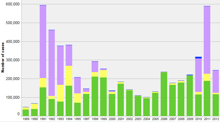
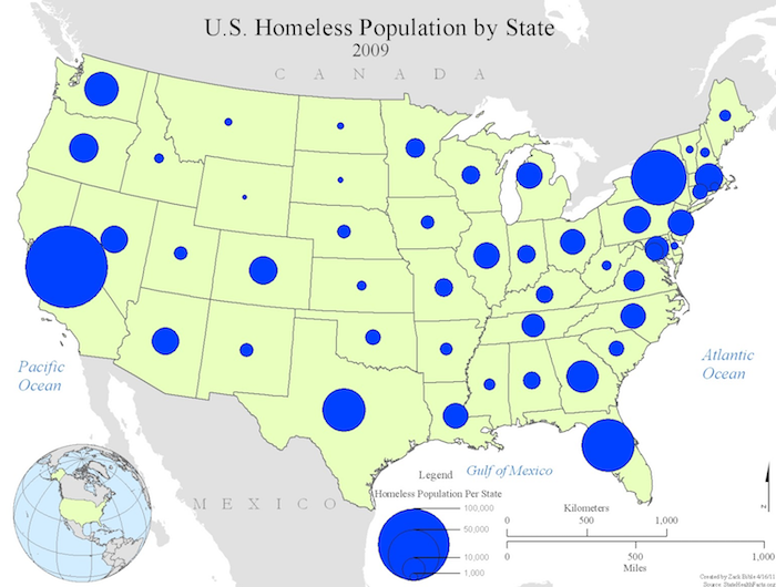
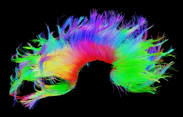
Outline
- Course information
- Data visualization
- Examples and uses
- Tools and software
Signage on moving walkways
Affordances In interaction design, affordances are properties of objects which show users the actions they can take.define what actions are possible.SignifiersSignifiers are physical signs, for example a word or a sound, that has a meaningspecify how people discover those possibilities: signifiers are signs, perceptible signals of what can be done.The Design of Everyday Things, Don Norman Visualization uses
Scope Actions Examples Communicate
Information- Inform
- Communicate
- Explain
- Presentations
- Hand-outs
- Instructions
- Infographics
- Signage
Analyze &
Model Data- Explore
- Analyze
- Discover
- Decide
- Spreadsheets
- Dashboards
- Notebooks
- Interactive graphics
Which information visualization use most relates to communicating information?
- Explore
- Analyze
- Explain ←
- Decide
Can replace complex calculations
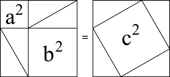
$a^2 + b^2 = c^2$ 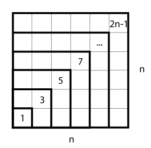
$1 + 3 + 5 + · · · + (2n − 1) = n^2$ 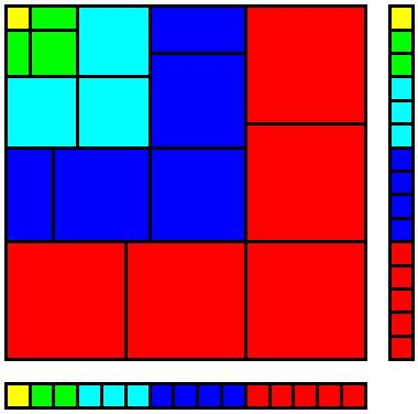
$\sum_{k=1}^{n}k^3 = \left( \sum_{k=1}^{n}k \right)^2$ Can reveal complex patterns, trends and outliers
193 189 297 311 247 351 223 413 342 Can reveal features not otherwise apparent
Anscombe's quartet (1973): importance of graphing data before analysis Can support memory and comprehension
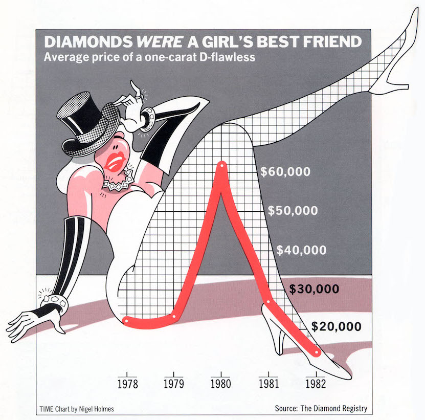
Can tell a story
Hans Rosling's 200 Countries, 200 Years
🔗 https://youtu.be/jbkSRLYSojoCan inform and engage more diverse audiences
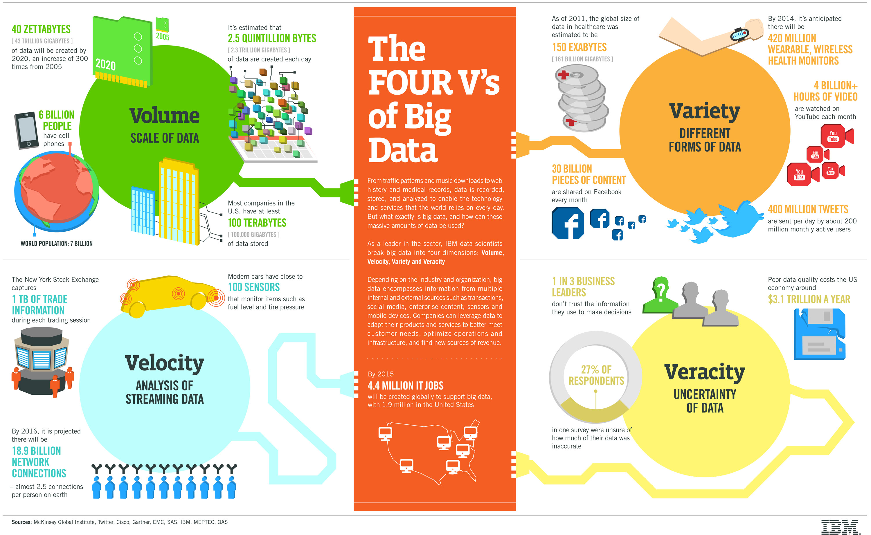
IBM Big Data & Analytics Hub - Infographics & Animations Visualizations are means to reach goals
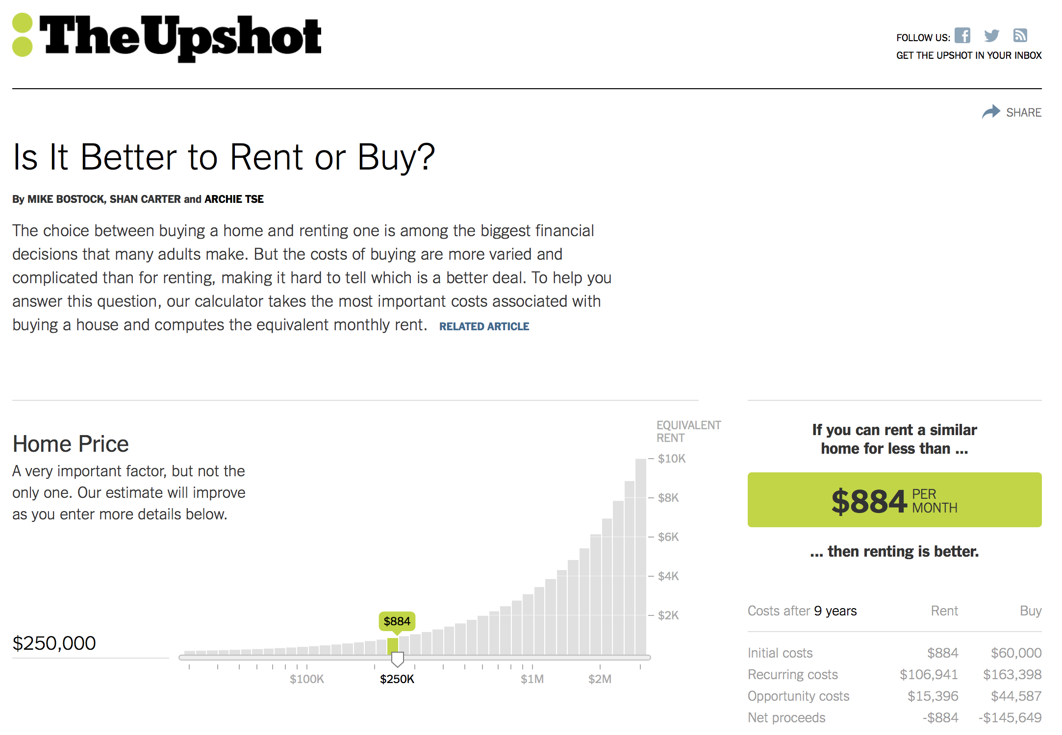
NYT Buy rent calculator Information graphics (infographics) are devices whose aim is to help an audience complete certain tasks
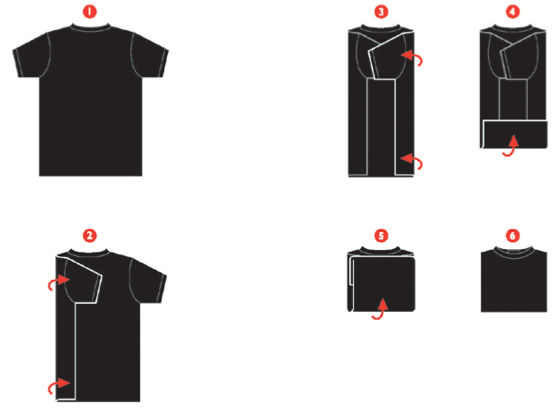
Wordless Diagrams (2005) by Nigel Holmes. Design considerations
Designers & users
Designer encodes
User decodes
Information → Visual encoding → Visual Decoding → Understanding What information designers use
Data related
User related
Form adapted to nature of information - User familiarity with form
- User knowledge of topic
- User abilities
- Display type and size
- Context where the form is used
The form should be constrained by the goals of the visualization

Google Analytics dashboard Form Follows Function
 20th-century modernist architecture and industrial design principle
The shape of an object should primarily relate to its intended function or purpose
Sullivan, Louis H. (1896). "The Tall Office Building Artistically Considered". Lippincott's Magazine (March 1896). Outline
- Course information
- Data visualization
- Examples and uses
- Tools and software
Visualization tools
Adapted from [Heer 2014] Satyanarayan, Arvind, and Jeffrey Heer. "Lyra: An interactive visualization design environment." In Computer Graphics Forum, 2014. D3.js
What it is
- Javascript client-side library
- D3 stands for Data-Driven Documents
- Uses recent HTML, SVG, and CSS
- Primarily made to use SVG (not raster graphics, i.e., images)
What it does
- Loads data in the browser memory
- Create elements and bind data to elements within the document
- Transform and customize elements
- Transition elements in response to user input
